
I just submitted a proposal to the 2016 edition of the Collective, so I’m finally getting around to putting screenshots of my baby on here. Our public library collects usage statistics at 19 branches.
Staff use our Intranet, or a desktop shortcut to our Google forms, to collect our daily program attendance, visitor count, and reference transactions.
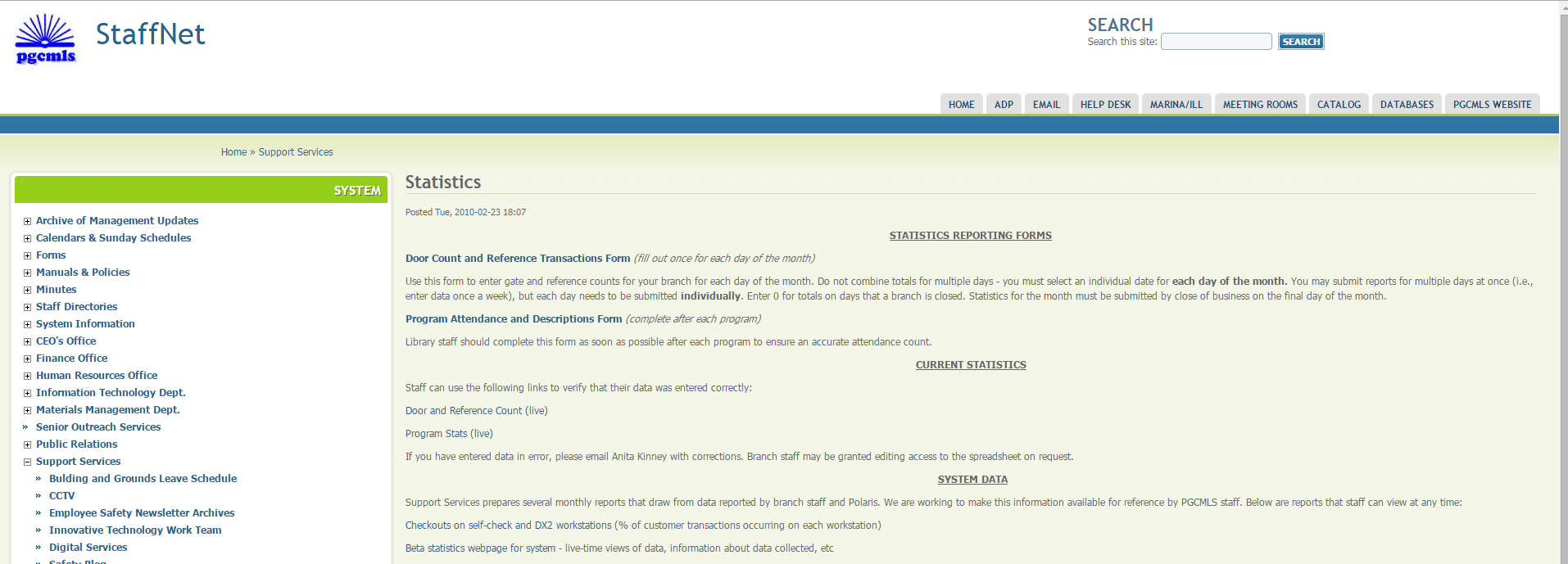
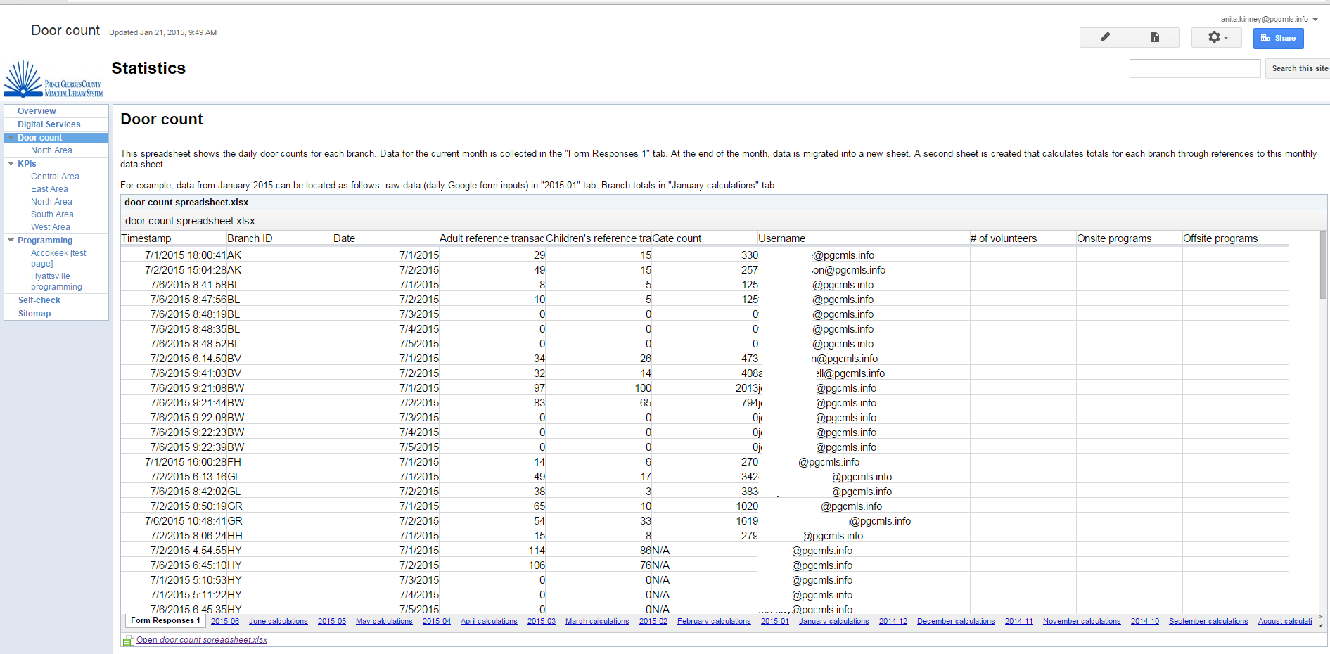
The forms look like this:
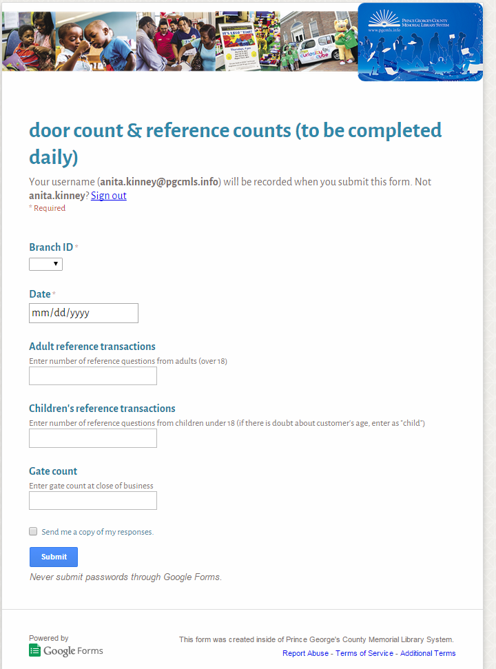
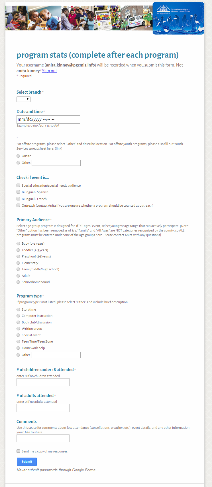
If you’ve used Google Forms, you can guess what the output looks like, but I’ll throw this up here anyway because it’s the setup for the cell references that go between sheets.
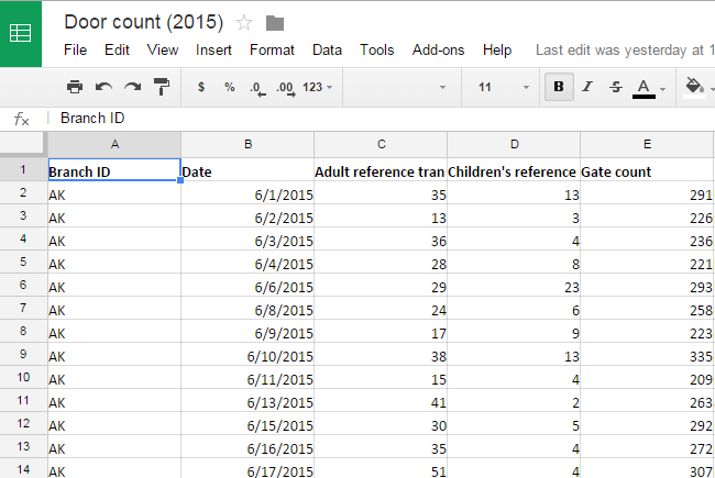
At the end of each month, I paste the entries from that month into one tab of the resultant spreadsheet (in this case, it’s the 2015-06 tab). What’s really cool about this is that you can then embed the spreadsheet into a Google Site, so that staff can see it and use Google Drive’s various filter functions.
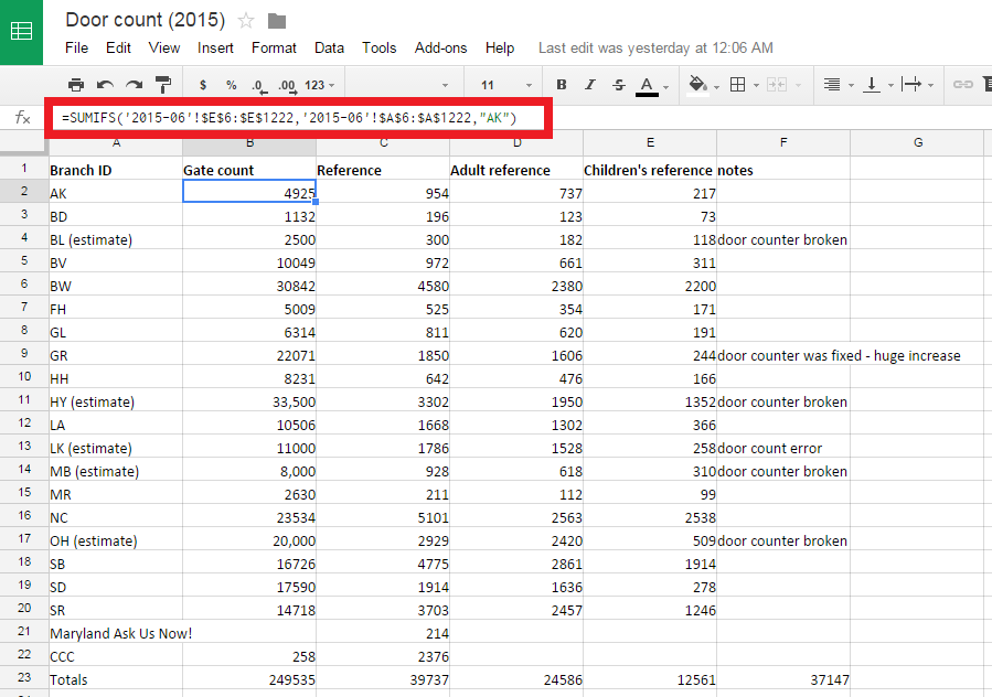
There’s a second tab for each month, in this case, “June Calculations.” Here’s where the magic happens. (Quick note: I’m starting to think pivot tables might provide better functionality in this area, but I didn’t realize in time that Google will let you do them….oops. At this point, I have 8 months of data from 19 branches in this Sheet, and it works really well, so, I’m just keeping it as-is.)
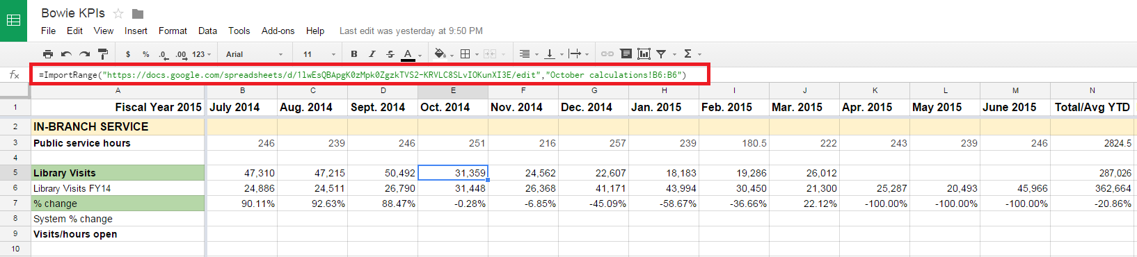
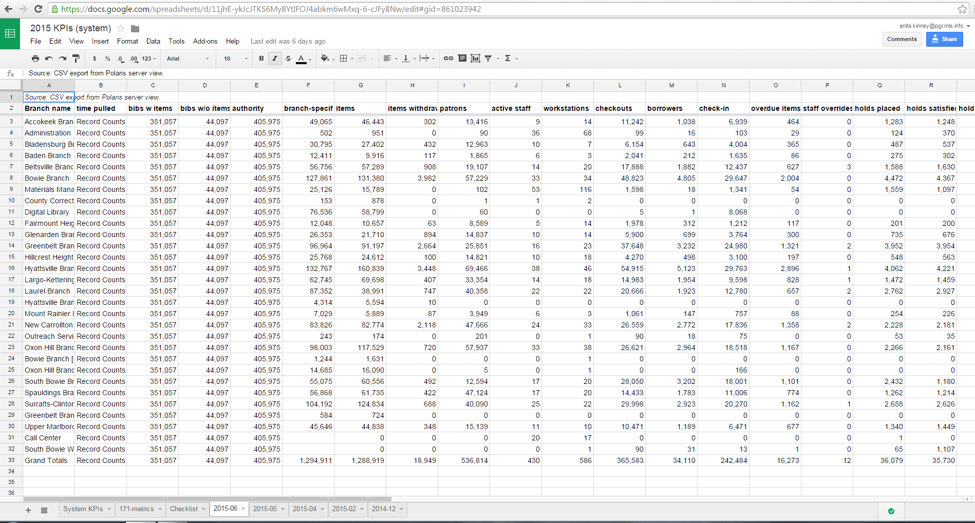
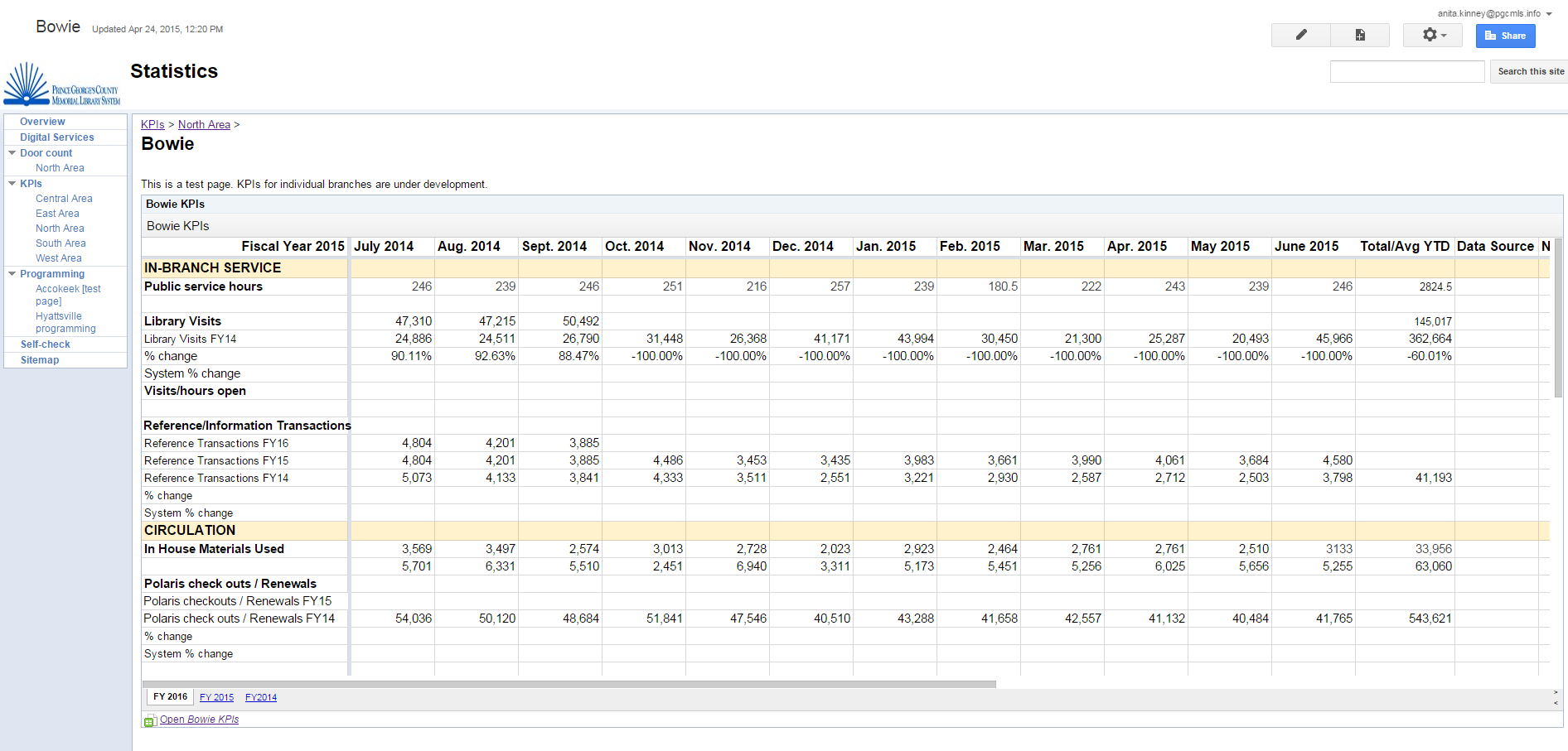
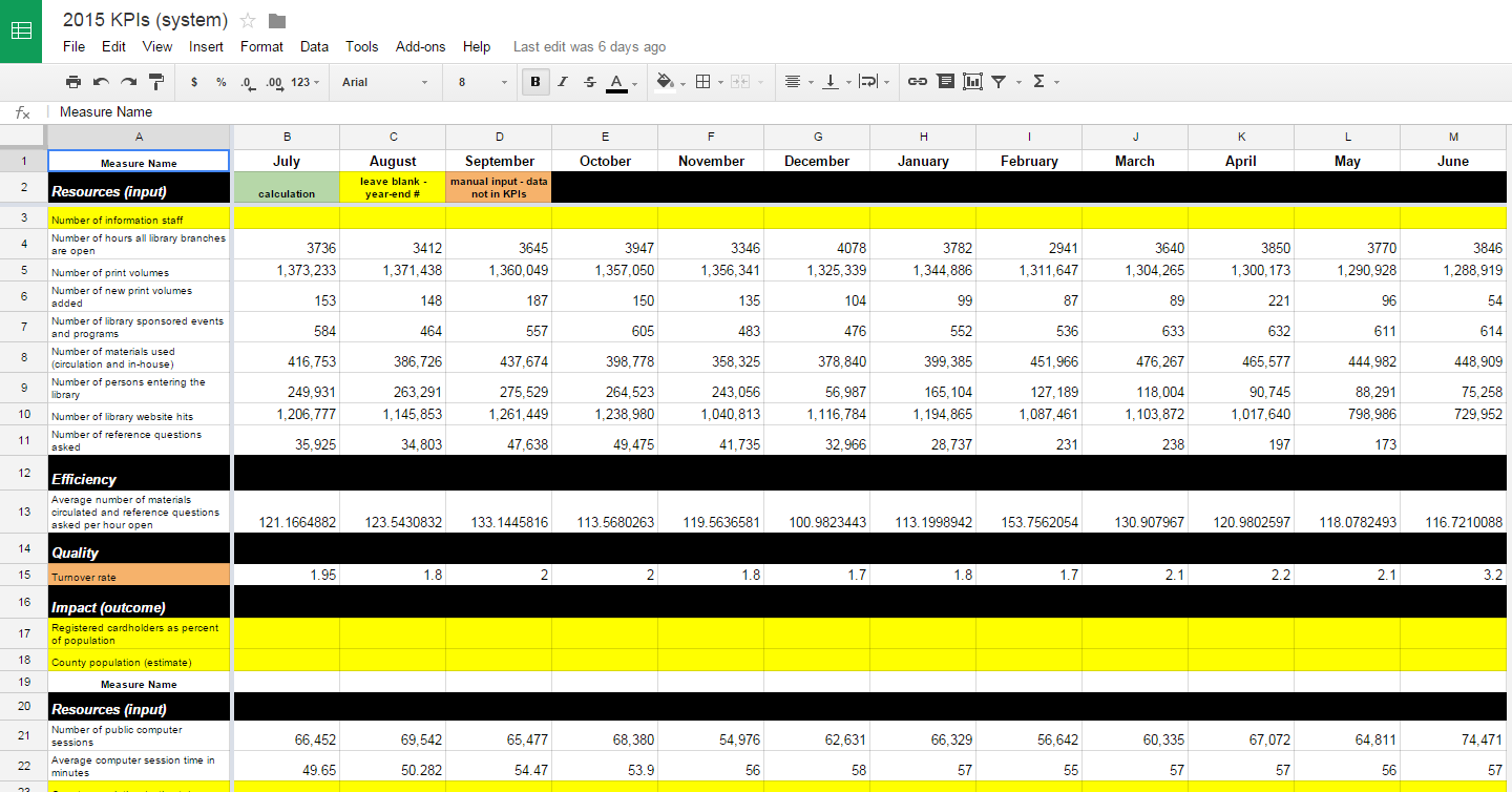
From here, we can set up a number of views of this data. My system’s CEO had worked with a consultant to create a series of Key Performance Indicators, and we also have a set of figures that the county requires monthly. Once you figure out how to do cell references between Google Sheets, you can probably imagine a lot of basic spreadsheets that can be combined in this way. Here’s an example of a KPI document for an individual library branch that references the monthly door count data:
Here’s the system-wide dashboard that the CEO, and anyone in the system, can reference:
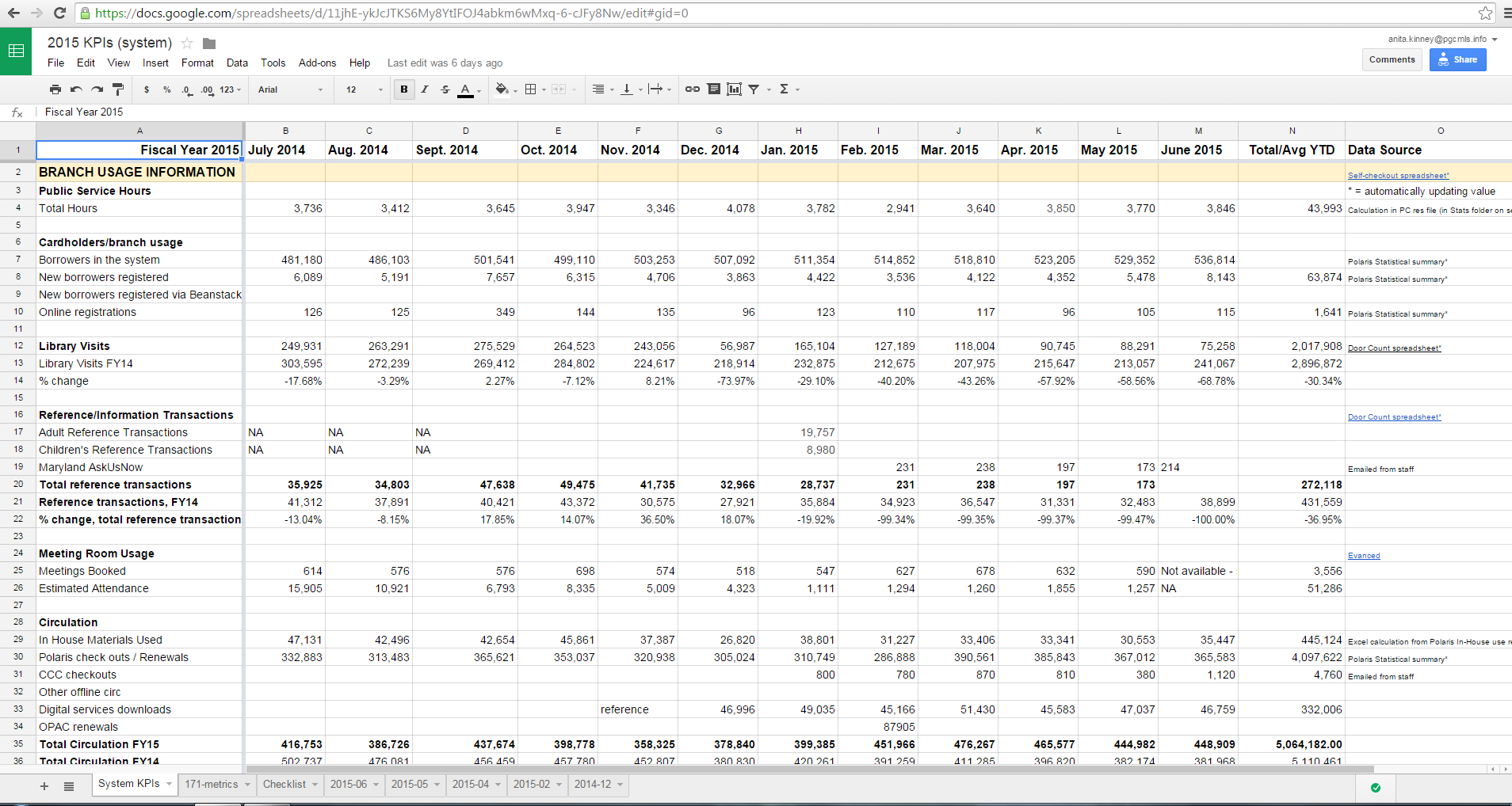
The really cool thing about doing things this way is that it lets me just do CSV dumps from our ILS, Polaris. (check this post for an overview of how things were done before I came on – yikes!) The cell references on the “System KPIs” tab either point to other Google Sheets populated by forms, or to data from the ILS that’s pasted into these monthly tabs. What this means is that if you have a SQL-based ILS, you can either create or commission a few queries that will spit out the data you need. The initial setup is kind of a pain, but it works like a charm once you’ve figured out how to structure your query to return data you can use: this still comes back with really sloppy column headings but once you map out what’s what, you can just have the headings ready to paste in in case you need to reference it later. (Fun fact: these numbers are ALWAYS an approximation because Polaris simply *does not always return the same values.*)
Setting up your KPIs like this also means that you have one place to put data about things like your digital services, so it saves time on a lot of levels.
I like that you can embed this stuff in your Google Site, too, so that staff can have a quick overview. Here’s a KPI for an individual branch as viewed in Google Sites:
I think long-term that it’s better to have this stuff in a SQL database since there are better plugins and visualization tools, but it’s hard to hire someone at public library salaries to maintain that stuff. I see potential for library systems to work collaboratively to commission a SQL-based product that would track library programs more effectively, since this can be done at a much lower cost than commercial reporting software. As is, there’s still some manual sorting when I’m asked questions like, “how many Spanish language storytimes did we have in the system last year?” but this is a huge step because the information is THERE now – before, we just had daily aggregate statistics for the total number of adult and kid programs and their attendance. Not hard to imagine the potential advantages here for grantwriting – everyone in the system now knows exactly where things are, where to get aggregate numbers and the master list of programs held in individual branches since October 2014.
Bonus: I set up my report to the county to auto-fill from the KPIs. Now I can paste the values into Excel and it’s done. I also have a checklist tab that keeps me on track while I’m filling these out, and that my boss can review to see my progress as each portion is completed.
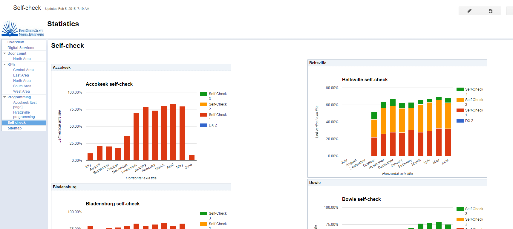
But you can get pretty OK visualization as long as you work within the limited charts that Google provides. Here’s the sheet that fills in the following charts, you can see everything here.
There is pretty much zero coding required.
Another tool I like is Infogr.am. I think the subscription is something like $150 for the year: it will also link into your Google Sheets with no coding, and if you can embed a Youtube video in your blog, you can figure out how to embed their charts in either Google Sites or another website of your choice. They give you a cleaner look and a few more options.
My system is organized into service areas of 4-5 branches, with a manager overseeing multiple branches. Here’s a chart that lets managers see quickly how their branches are doing and whether there are any trends. I like that you can view the years in the same chart:

My biggest takeaway from the past year of doing this is that the best system is the one that the most people can use. I think this was an elegant, no-cost (we already had an institutional subscription to Google Apps/GMail) solution to that end and I hope to be able to share it with folks at The Collective next year.